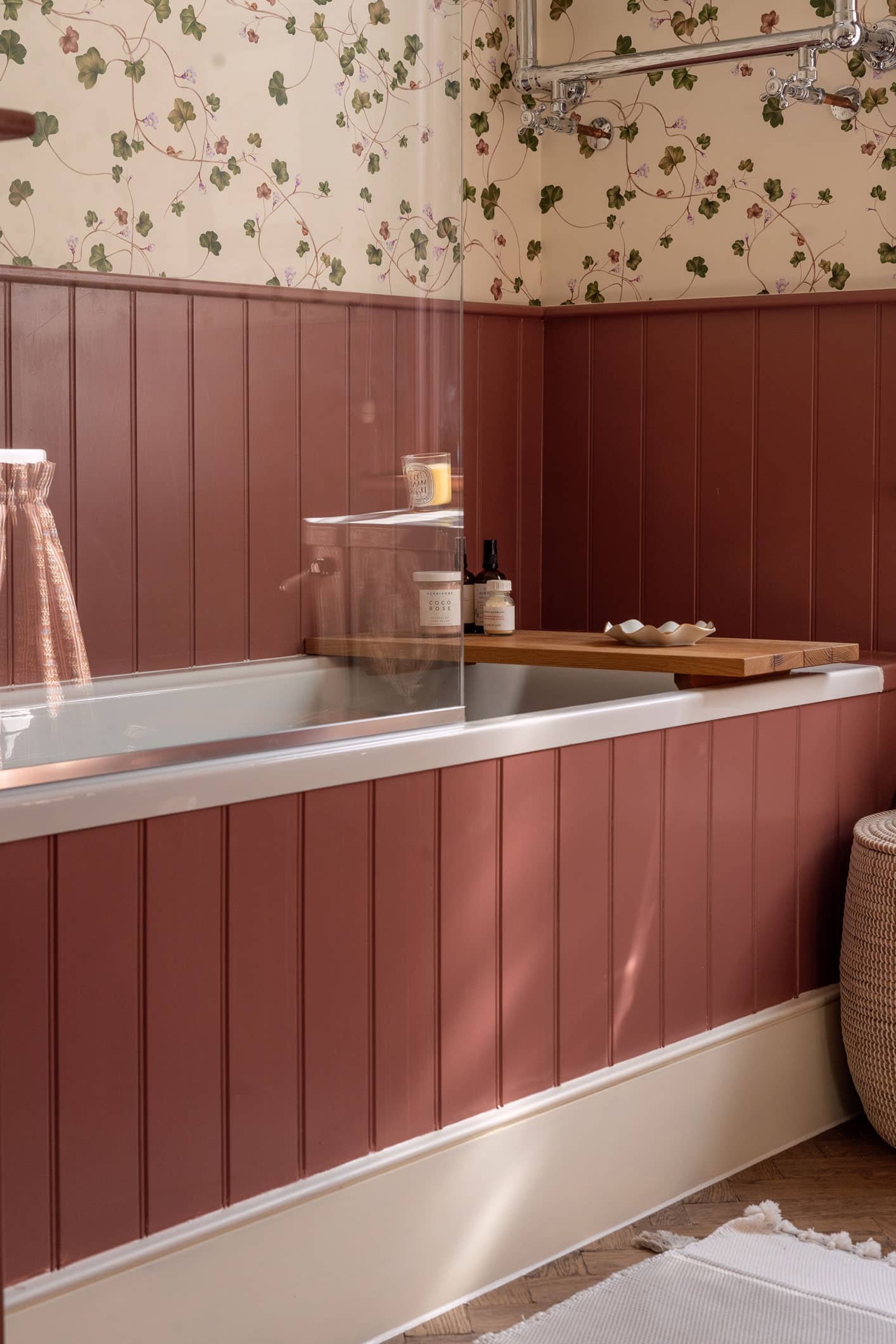
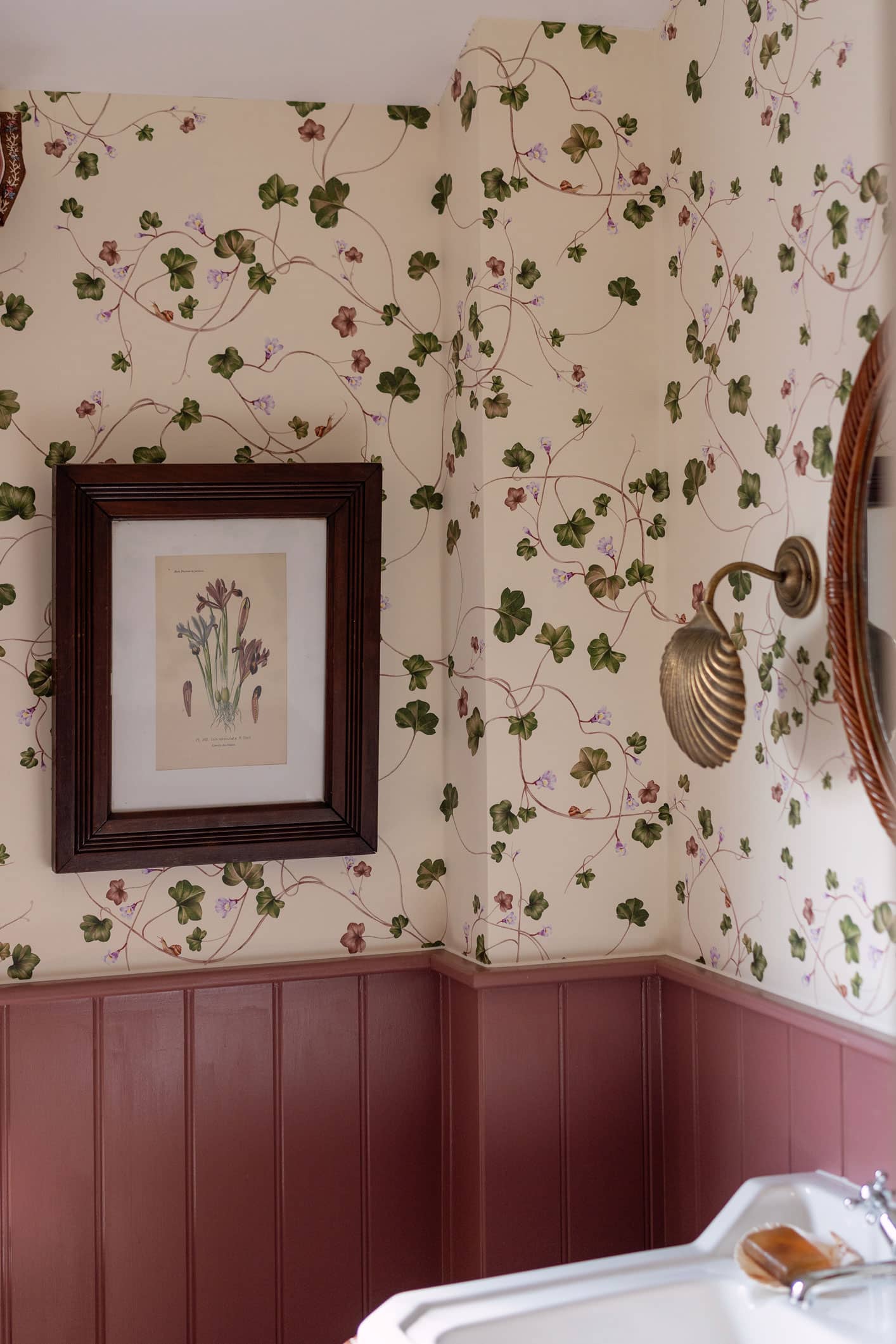
The final room reveal of the new house is this special little maroon bathroom which is a wonderful mix of reds and browns; dark wood, brass and painted joinery. This is the bathroom that the girls use so I wanted it to be a bit more playful.Not only that but there is a pretty bold design decision in here…snails on the wallpaper?!
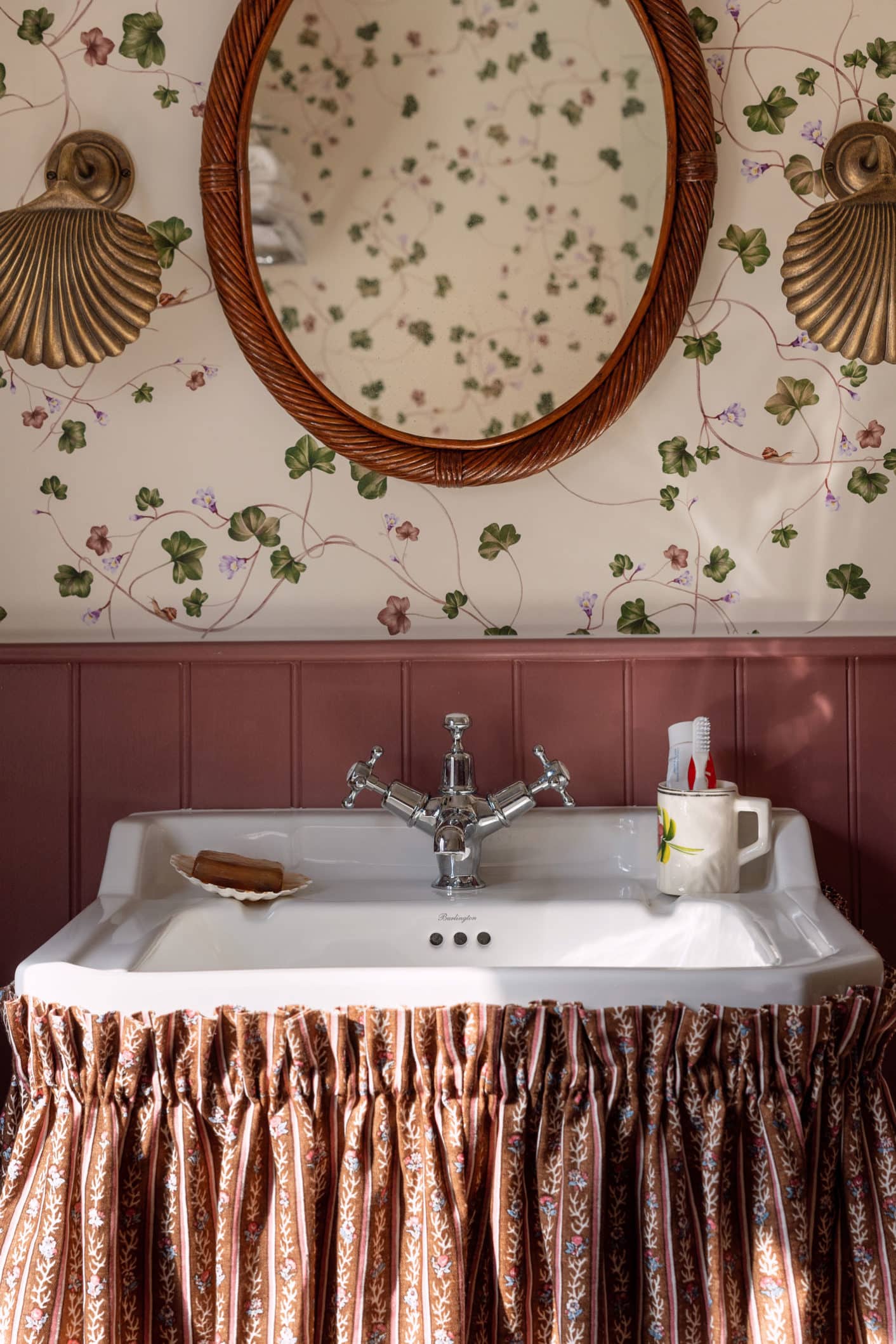
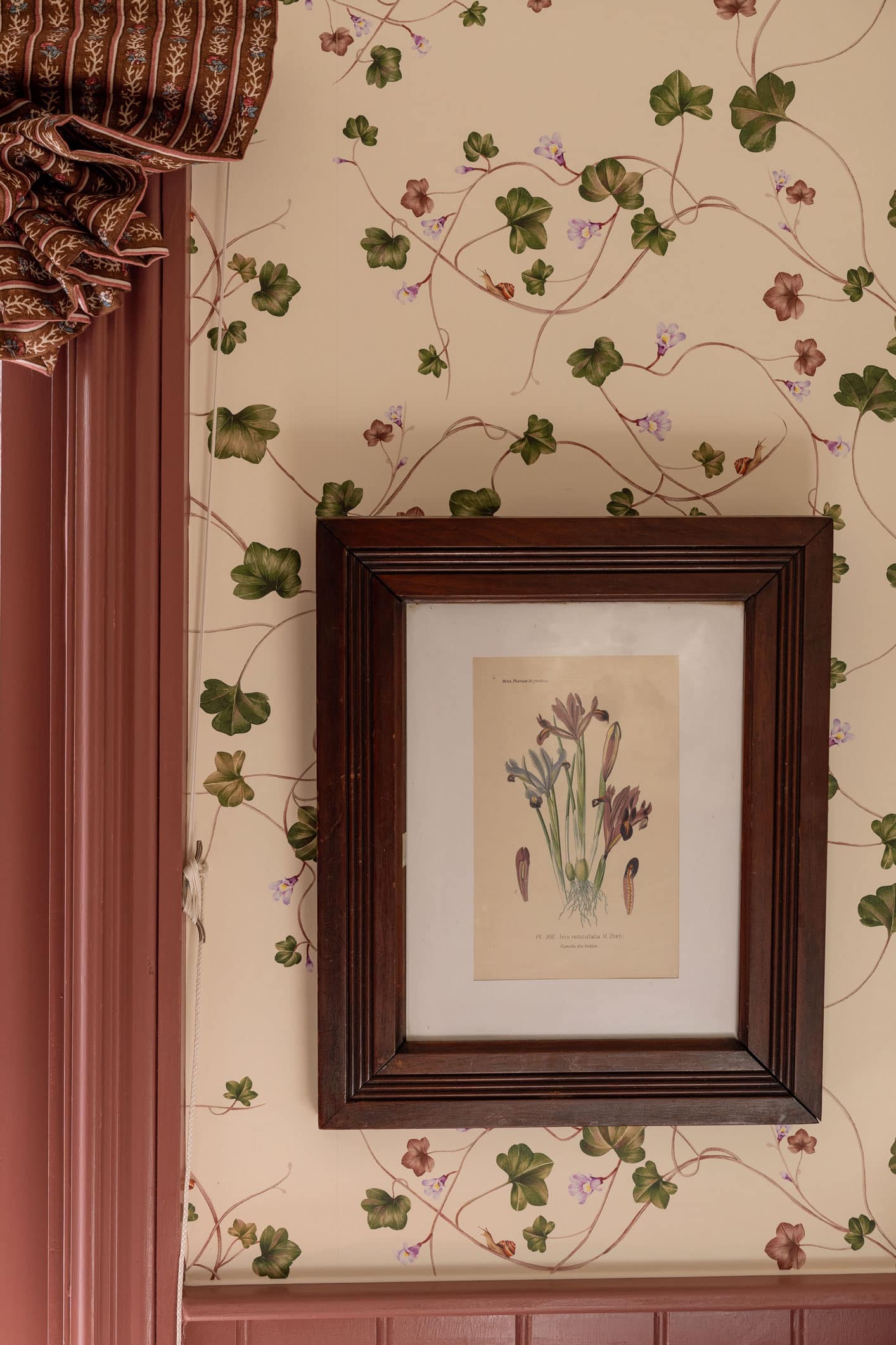
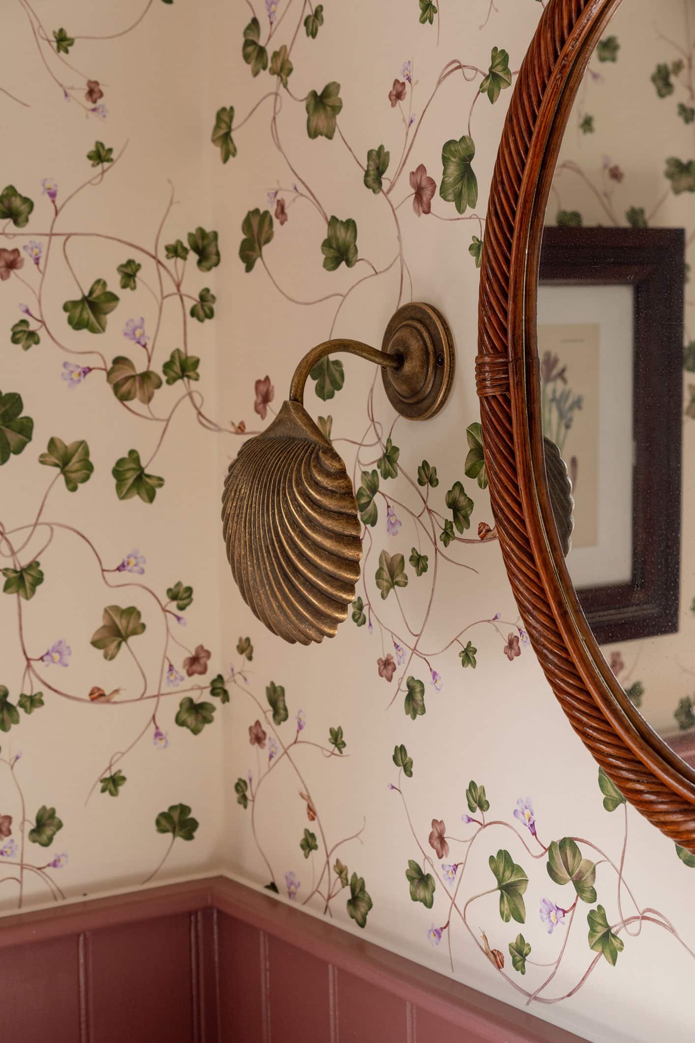
I love using a vibrant print in a small room so have used wallpapers a lot in bathrooms and smaller spaces. This one is Creeping Toadflax by Living Quarters; it’s a climbing vine with some flowers (and even a tiny snail or two) and the repeat is over two rolls so it’s a really beautiful result when it’s finished. I love the colours in it; it’s a mix between being elegant and fun. The paper Is coated so it’s ok to have in a bathroom provided it doesn’t get soaked! The paint is Pompadour by Edward Bulmer which is a bit bolder than in my other bathrooms. I fell in love with it after seeing Laura Fantacci use it and it’s a great colour alongside the Ebony Oak Aged Parquet wooden flooring. We used the Edward Bulmer paint on the panelling and then added the wallpaper above.
This is a great space in which to experiment with my antique framed prints that I picked up in Paris; I found big heavy frames for them in an antiques shop in Oxfordshire. The shell sconces on the wall are from Jim Lawrence and were originally in the guest room ensuite; I found a mirror and brass shell towel rail on Etsy so it’s a perfect example of vintage mixed with modern.
The sink, bath and WC are all from Burlington Bathrooms– I love that the gloss mahogany loo seat works so well with the colours in this room. I don’t like having too much of the ceramic on display so I had a basin skirt made out of the same fabric as I have on the blind- Nicobar by Lisa Fine Textiles. A sink skirt is very useful for making a sink look pretty and for hiding things; it’s attached by Velcro so it’s very easy to take off and wash too. The result is a real bubble of colour and coordinating shades; which room is your favourite?
xx,

